XY Charts
Create bar charts and line charts with customizable axes. Ideal for data visualization and trend analysis.
What is XY Charts?
XY Charts are versatile data visualization tools that plot data points on a two-dimensional coordinate system. Supporting both bar charts and line charts, they are fundamental for showing trends, comparisons, and distributions. XY charts are among the most commonly used chart types in business reporting, scientific research, and data analysis.
Edit and preview
Build a XY Charts with Mermaid syntax and see changes instantly.
Example
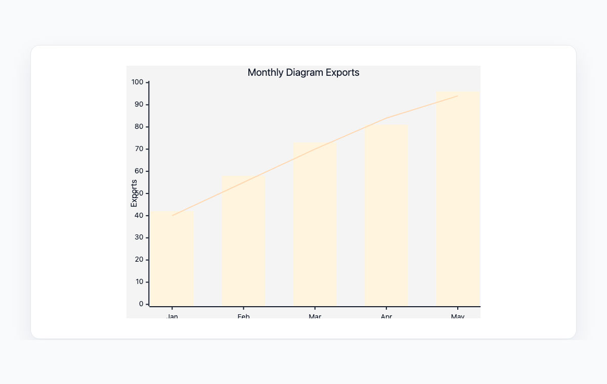
XY chart example
A Mermaid XY chart combining bars and a line for monthly diagram exports.
Mermaid code
xychart-beta
    title "Monthly Diagram Exports"
    x-axis [Jan, Feb, Mar, Apr, May]
    y-axis "Exports" 0 --> 100
    bar [42, 58, 73, 81, 96]
    line [40, 55, 70, 84, 94]
Common Use Cases
Trend Analysis
Track metrics over time with line charts. Visualize growth trends, seasonal patterns, and performance trajectories.
Comparison Reports
Compare values across categories with bar charts. Show revenue by region, scores by team, or counts by category.
Performance Dashboards
Create visual summaries of key metrics. Combine bars and lines to show both absolute values and trends.
Data Documentation
Include charts in technical documentation and reports. Keep data visualizations version-controlled alongside text content.
Key Features
Bar Charts
Create vertical bar charts with custom data values and category labels for categorical comparisons.
Line Charts
Plot continuous data with line charts to show trends and changes over time or across categories.
Custom Axes
Define axis labels, ranges, and categories. Set minimum and maximum values for precise data representation.
Combined Charts
Overlay bar and line charts in the same visualization to show multiple data dimensions simultaneously.
Best Practices
Choose the Right Chart Type
Use bars for categorical comparisons and lines for trends over time. Combine them when showing both aspects.
Label Axes Clearly
Always include axis labels with units. Readers should understand what the chart shows without additional explanation.
Start Y-Axis at Zero
For bar charts, start the y-axis at zero to avoid misleading visual proportions.
Keep Data Sets Focused
Show one or two data series per chart. Too many overlapping series make charts hard to read.
Explore other diagram types
Flowcharts
Visualize processes, workflows, and algorithms with nodes and directional arrows. Perfect for business processes and decision trees.
Sequence Diagrams
Document interactions between different actors or systems over time. Ideal for API documentation and system design.
Class Diagrams
Model object-oriented systems with classes, attributes, and relationships. Essential for software architecture planning.
State Diagrams
Represent state transitions in systems or applications. Great for modeling lifecycle states and workflows.
Gantt Charts
Plan and track project timelines with tasks and dependencies. Perfect for project management and scheduling.
ER Diagrams
Design database schemas with entities and relationships. Ideal for database modeling and documentation.
User Journey
Map user experiences and interactions across touchpoints. Excellent for UX design and customer journey mapping.
Git Graphs
Visualize Git branching strategies and commit histories. Helpful for explaining version control workflows.
Mindmaps
Organize ideas, brainstorm concepts, and create hierarchical visual structures. Perfect for planning and knowledge mapping.
Pie Charts
Display proportional data distributions with circular charts. Ideal for showing percentages and market share breakdowns.
Timelines
Visualize chronological events and milestones along a time axis. Great for project histories and roadmaps.
Kanban Boards
Organize tasks into columns representing workflow stages. Perfect for agile project management and task tracking.
Quadrant Charts
Plot items on a two-axis grid to compare and prioritize. Ideal for feature prioritization and strategic analysis.
Sankey Diagrams
Visualize flow quantities between nodes with proportional arrows. Perfect for energy flows, budget allocation, and conversion funnels.
Block Diagrams
Build structured layouts with blocks arranged in columns and rows. Great for system architecture and component overviews.
Architecture Diagrams
Design cloud and system architecture with service icons and connections. Perfect for infrastructure documentation.
Packet Diagrams
Visualize network protocol packet structures with bit-level field layouts. Essential for network protocol documentation.