Quadrant Charts
Plot items on a two-axis grid to compare and prioritize. Ideal for feature prioritization and strategic analysis.
What is Quadrant Charts?
Quadrant charts divide a two-dimensional space into four sections using two axes, allowing you to plot and categorize items based on two criteria simultaneously. Also known as matrix diagrams or 2x2 matrices, they are widely used in strategic planning, feature prioritization, risk assessment, and competitive analysis. Each quadrant represents a different combination of the two dimensions.
Edit and preview
Build a Quadrant Charts with Mermaid syntax and see changes instantly.
Example
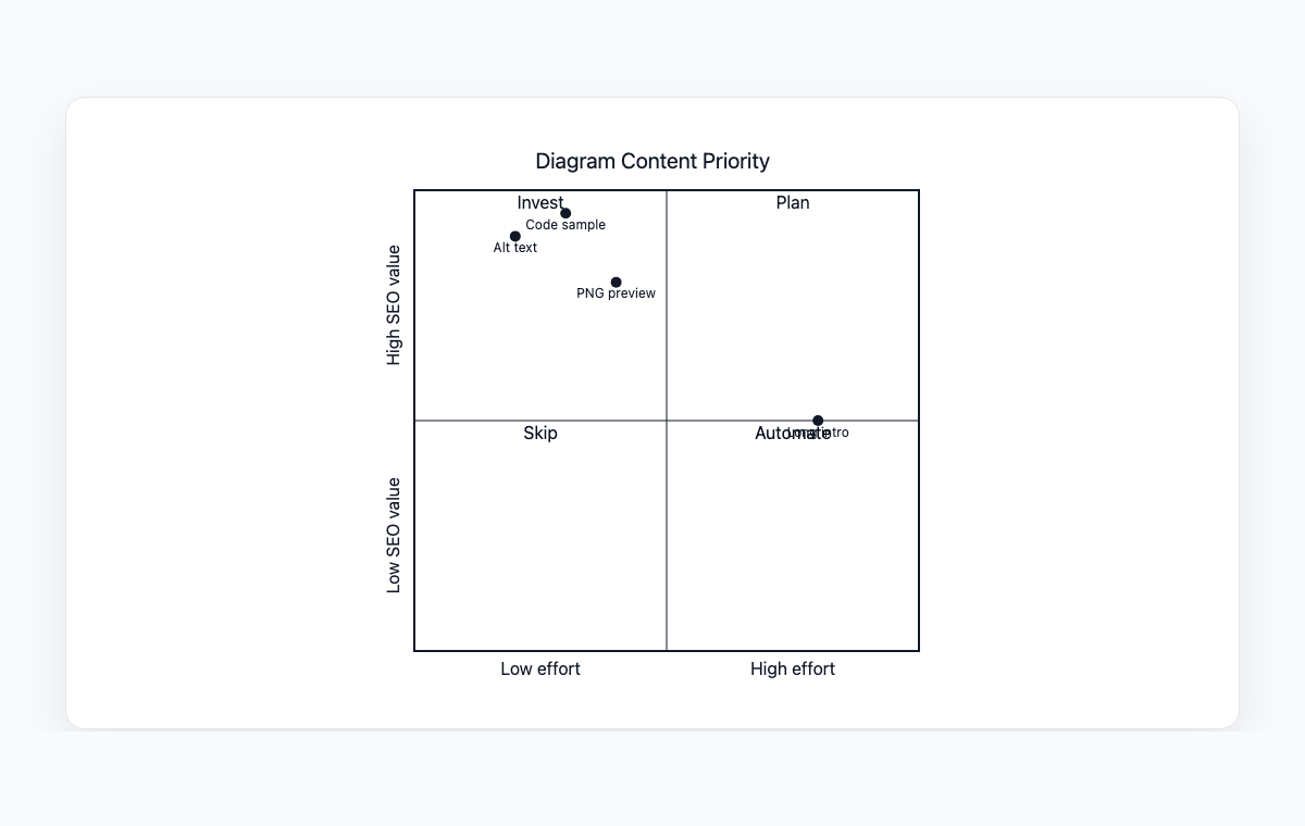
Quadrant chart example
A Mermaid quadrant chart comparing diagram content by effort and SEO value.
Mermaid code
quadrantChart
    title Diagram Content Priority
    x-axis Low effort --> High effort
    y-axis Low SEO value --> High SEO value
    quadrant-1 Plan
    quadrant-2 Invest
    quadrant-3 Skip
    quadrant-4 Automate
    Alt text: [0.2, 0.9]
    PNG preview: [0.4, 0.8]
    Code sample: [0.3, 0.95]
    Long intro: [0.8, 0.5]
Common Use Cases
Feature Prioritization
Plot features on effort vs. impact axes to decide what to build first. Quickly identify quick wins and strategic investments.
Risk Assessment
Map risks by probability and impact to prioritize mitigation efforts. Visualize which risks need immediate attention.
Competitive Analysis
Compare competitors on two key dimensions like price vs. quality or features vs. usability.
Eisenhower Matrix
Organize tasks by urgency and importance. Separate what needs to be done now from what can be scheduled or delegated.
Key Features
Custom Axes
Define custom labels for both the x-axis and y-axis with directional indicators for clear dimension representation.
Quadrant Labels
Name each of the four quadrants to clearly define what each section represents.
Data Point Plotting
Place items at specific coordinates within the chart to show their relative position on both dimensions.
Title Support
Add descriptive titles to provide context and explain what the chart is analyzing.
Best Practices
Choose Meaningful Axes
Select two dimensions that are truly independent and relevant to your analysis. The axes should create actionable quadrants.
Label Quadrants Clearly
Give each quadrant an action-oriented label like 'Do First', 'Schedule', 'Delegate', or 'Eliminate'.
Limit Data Points
Keep the number of plotted items manageable. Too many points create visual clutter and reduce clarity.
Be Precise with Placement
Position items carefully on the axes. The relative positions should reflect real differences in the two dimensions.
Explore other diagram types
Flowcharts
Visualize processes, workflows, and algorithms with nodes and directional arrows. Perfect for business processes and decision trees.
Sequence Diagrams
Document interactions between different actors or systems over time. Ideal for API documentation and system design.
Class Diagrams
Model object-oriented systems with classes, attributes, and relationships. Essential for software architecture planning.
State Diagrams
Represent state transitions in systems or applications. Great for modeling lifecycle states and workflows.
Gantt Charts
Plan and track project timelines with tasks and dependencies. Perfect for project management and scheduling.
ER Diagrams
Design database schemas with entities and relationships. Ideal for database modeling and documentation.
User Journey
Map user experiences and interactions across touchpoints. Excellent for UX design and customer journey mapping.
Git Graphs
Visualize Git branching strategies and commit histories. Helpful for explaining version control workflows.
Mindmaps
Organize ideas, brainstorm concepts, and create hierarchical visual structures. Perfect for planning and knowledge mapping.
Pie Charts
Display proportional data distributions with circular charts. Ideal for showing percentages and market share breakdowns.
Timelines
Visualize chronological events and milestones along a time axis. Great for project histories and roadmaps.
Kanban Boards
Organize tasks into columns representing workflow stages. Perfect for agile project management and task tracking.
Sankey Diagrams
Visualize flow quantities between nodes with proportional arrows. Perfect for energy flows, budget allocation, and conversion funnels.
XY Charts
Create bar charts and line charts with customizable axes. Ideal for data visualization and trend analysis.
Block Diagrams
Build structured layouts with blocks arranged in columns and rows. Great for system architecture and component overviews.
Architecture Diagrams
Design cloud and system architecture with service icons and connections. Perfect for infrastructure documentation.
Packet Diagrams
Visualize network protocol packet structures with bit-level field layouts. Essential for network protocol documentation.