Sankey Diagrams
Visualize flow quantities between nodes with proportional arrows. Perfect for energy flows, budget allocation, and conversion funnels.
What is Sankey Diagrams?
Sankey diagrams are flow diagrams where the width of arrows is proportional to the flow quantity they represent. They excel at showing how quantities flow, split, and merge through a system. Named after Irish Captain Matthew Sankey, these diagrams are invaluable for visualizing energy transfers, budget flows, conversion funnels, and any process where understanding proportional flows is important.
Edit and preview
Build a Sankey Diagrams with Mermaid syntax and see changes instantly.
Example
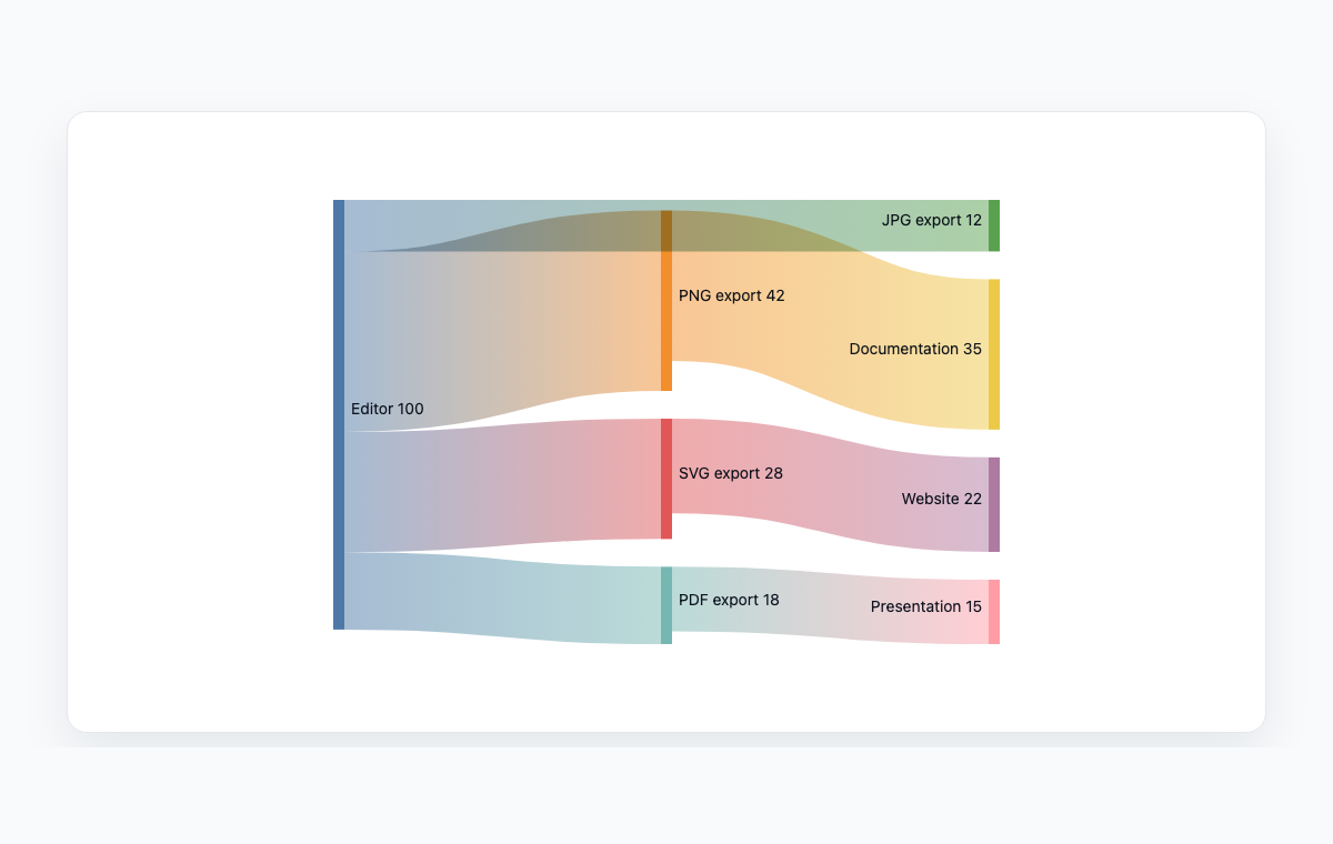
Sankey diagram example
A Mermaid sankey diagram showing how editor exports flow into documentation uses.
Mermaid code
sankey-beta
Editor,PNG export,42
Editor,SVG export,28
Editor,PDF export,18
Editor,JPG export,12
PNG export,Documentation,35
SVG export,Website,22
PDF export,Presentation,15
Common Use Cases
Conversion Funnel Analysis
Visualize user flow through marketing or sales funnels. See where users drop off and how traffic converts at each stage.
Energy Flow Visualization
Show how energy is generated, transformed, and consumed across a system. Track losses and efficiency at each stage.
Budget and Cost Flows
Illustrate how money flows from revenue sources through departments to expenses. Make financial distributions intuitive.
Supply Chain Mapping
Trace materials and products from suppliers through manufacturing to distribution. Visualize quantities at each stage.
Key Features
Proportional Arrows
Arrow width automatically scales to represent flow quantities, making relative volumes immediately visible.
Node Labels
Define source and target nodes with descriptive labels to identify each stage or entity in the flow.
Multiple Flows
Show flows splitting from one source to multiple targets, or multiple sources merging into one target.
Simple CSV-like Syntax
Define flows using intuitive source, target, value triples that are easy to write and maintain.
Best Practices
Flow Left to Right
Arrange the diagram so flows move left to right, matching natural reading direction and temporal progression.
Use Meaningful Node Names
Label nodes clearly so readers immediately understand what each stage or entity represents.
Limit Complexity
Keep the number of flows and nodes manageable. Too many crossing arrows reduce readability.
Ensure Data Accuracy
Verify that flow values are accurate, as the visual proportions directly communicate quantities to readers.
Explore other diagram types
Flowcharts
Visualize processes, workflows, and algorithms with nodes and directional arrows. Perfect for business processes and decision trees.
Sequence Diagrams
Document interactions between different actors or systems over time. Ideal for API documentation and system design.
Class Diagrams
Model object-oriented systems with classes, attributes, and relationships. Essential for software architecture planning.
State Diagrams
Represent state transitions in systems or applications. Great for modeling lifecycle states and workflows.
Gantt Charts
Plan and track project timelines with tasks and dependencies. Perfect for project management and scheduling.
ER Diagrams
Design database schemas with entities and relationships. Ideal for database modeling and documentation.
User Journey
Map user experiences and interactions across touchpoints. Excellent for UX design and customer journey mapping.
Git Graphs
Visualize Git branching strategies and commit histories. Helpful for explaining version control workflows.
Mindmaps
Organize ideas, brainstorm concepts, and create hierarchical visual structures. Perfect for planning and knowledge mapping.
Pie Charts
Display proportional data distributions with circular charts. Ideal for showing percentages and market share breakdowns.
Timelines
Visualize chronological events and milestones along a time axis. Great for project histories and roadmaps.
Kanban Boards
Organize tasks into columns representing workflow stages. Perfect for agile project management and task tracking.
Quadrant Charts
Plot items on a two-axis grid to compare and prioritize. Ideal for feature prioritization and strategic analysis.
XY Charts
Create bar charts and line charts with customizable axes. Ideal for data visualization and trend analysis.
Block Diagrams
Build structured layouts with blocks arranged in columns and rows. Great for system architecture and component overviews.
Architecture Diagrams
Design cloud and system architecture with service icons and connections. Perfect for infrastructure documentation.
Packet Diagrams
Visualize network protocol packet structures with bit-level field layouts. Essential for network protocol documentation.