Pie Charts
Display proportional data distributions with circular charts. Ideal for showing percentages and market share breakdowns.
What is Pie Charts?
Pie charts are circular statistical graphics divided into slices to illustrate numerical proportions. Each slice represents a category's contribution to the whole, with the arc length proportional to the quantity it represents. Pie charts are one of the most recognizable chart types, ideal for showing percentage distributions, market shares, and simple data compositions at a glance.
Edit and preview
Build a Pie Charts with Mermaid syntax and see changes instantly.
Example
Pie chart example
A Mermaid pie chart comparing common diagram export formats.
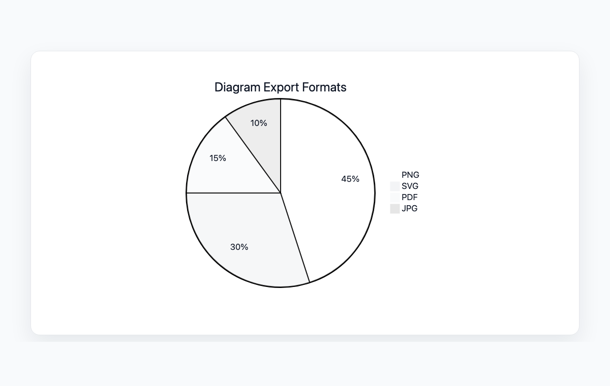
Mermaid code
pie title Diagram Export Formats
    "PNG" : 45
    "SVG" : 30
    "PDF" : 15
    "JPG" : 10
Common Use Cases
Budget Allocation
Visualize how budgets are distributed across departments, projects, or categories. Make spending patterns immediately visible to stakeholders.
Market Share Analysis
Display competitive landscape with market share percentages. Compare product or company positions in a market at a glance.
Survey Results
Present survey response distributions in an intuitive visual format. Show how respondents are divided across different answer choices.
Resource Distribution
Illustrate how resources like time, staff, or computing power are allocated across different tasks or teams.
Key Features
Automatic Proportions
Simply provide values and Mermaid calculates the correct proportions and angles for each slice automatically.
Chart Titles
Add descriptive titles to provide context for the data being visualized.
Category Labels
Each slice is labeled with its category name and value for clear data identification.
Color Coding
Slices are automatically color-coded with distinct colors for easy differentiation between categories.
Best Practices
Limit Categories
Use 5-7 categories maximum. Too many slices make pie charts hard to read. Group small categories into 'Other'.
Use for Parts of a Whole
Pie charts work best when showing how parts make up a total. Don't use them for comparing unrelated values.
Order Slices Logically
Arrange slices from largest to smallest, or in a meaningful sequence that helps readers understand the data.
Include Values
Always show the actual numbers or percentages alongside slices so readers can make precise comparisons.
Explore other diagram types
Flowcharts
Visualize processes, workflows, and algorithms with nodes and directional arrows. Perfect for business processes and decision trees.
Sequence Diagrams
Document interactions between different actors or systems over time. Ideal for API documentation and system design.
Class Diagrams
Model object-oriented systems with classes, attributes, and relationships. Essential for software architecture planning.
State Diagrams
Represent state transitions in systems or applications. Great for modeling lifecycle states and workflows.
Gantt Charts
Plan and track project timelines with tasks and dependencies. Perfect for project management and scheduling.
ER Diagrams
Design database schemas with entities and relationships. Ideal for database modeling and documentation.
User Journey
Map user experiences and interactions across touchpoints. Excellent for UX design and customer journey mapping.
Git Graphs
Visualize Git branching strategies and commit histories. Helpful for explaining version control workflows.
Mindmaps
Organize ideas, brainstorm concepts, and create hierarchical visual structures. Perfect for planning and knowledge mapping.
Timelines
Visualize chronological events and milestones along a time axis. Great for project histories and roadmaps.
Kanban Boards
Organize tasks into columns representing workflow stages. Perfect for agile project management and task tracking.
Quadrant Charts
Plot items on a two-axis grid to compare and prioritize. Ideal for feature prioritization and strategic analysis.
Sankey Diagrams
Visualize flow quantities between nodes with proportional arrows. Perfect for energy flows, budget allocation, and conversion funnels.
XY Charts
Create bar charts and line charts with customizable axes. Ideal for data visualization and trend analysis.
Block Diagrams
Build structured layouts with blocks arranged in columns and rows. Great for system architecture and component overviews.
Architecture Diagrams
Design cloud and system architecture with service icons and connections. Perfect for infrastructure documentation.
Packet Diagrams
Visualize network protocol packet structures with bit-level field layouts. Essential for network protocol documentation.